 Base
Base Unichain
 Robinhood
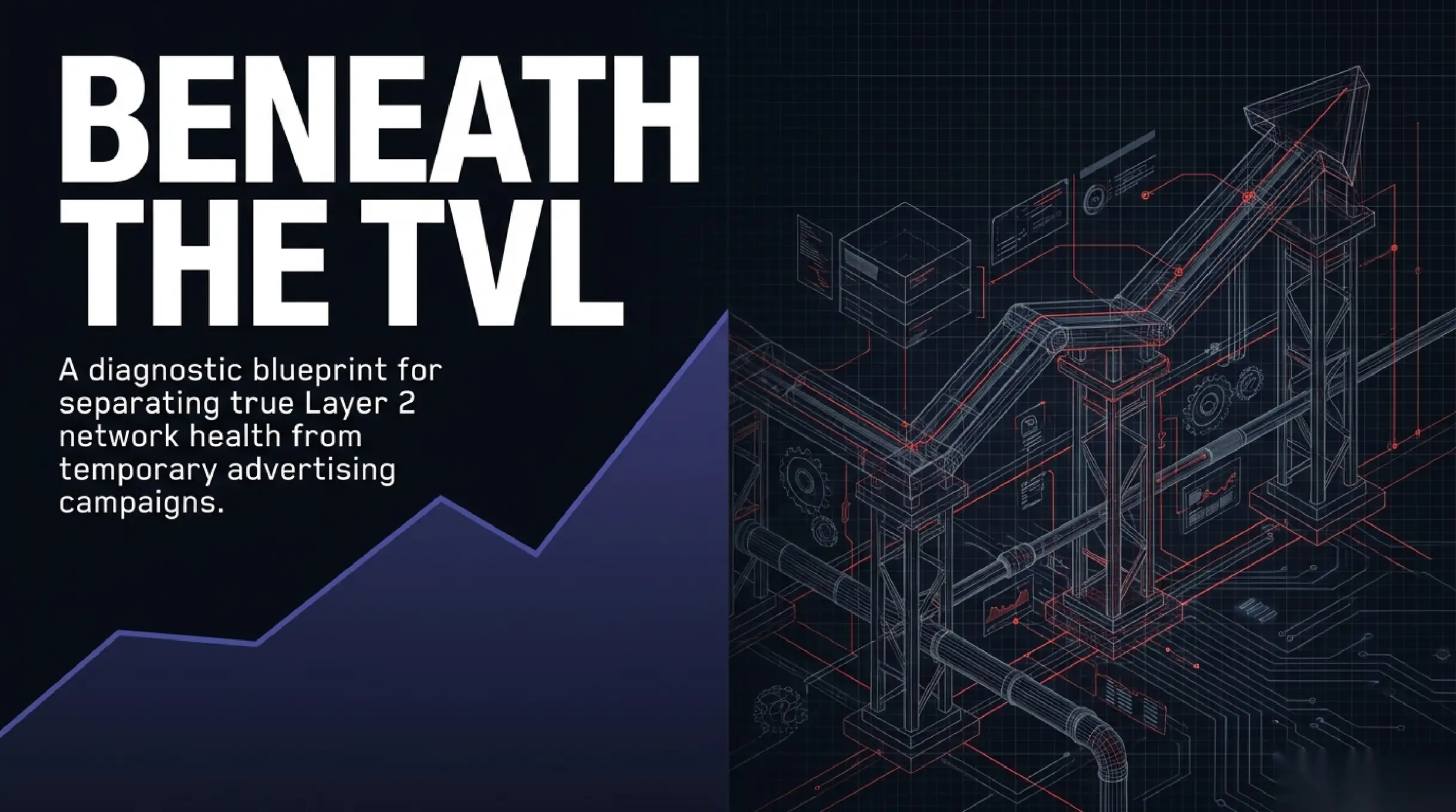
Almost every dashboard reflexively draws a rising TVL line and captions it as proof of success. In practice, total value locked is the most misleading metric in the world of rollups. It reacts to asset prices, to temporary incentives and to capital rotating between chains far more than to genuine user demand. The chart climbs while the network itself can be emptying out.
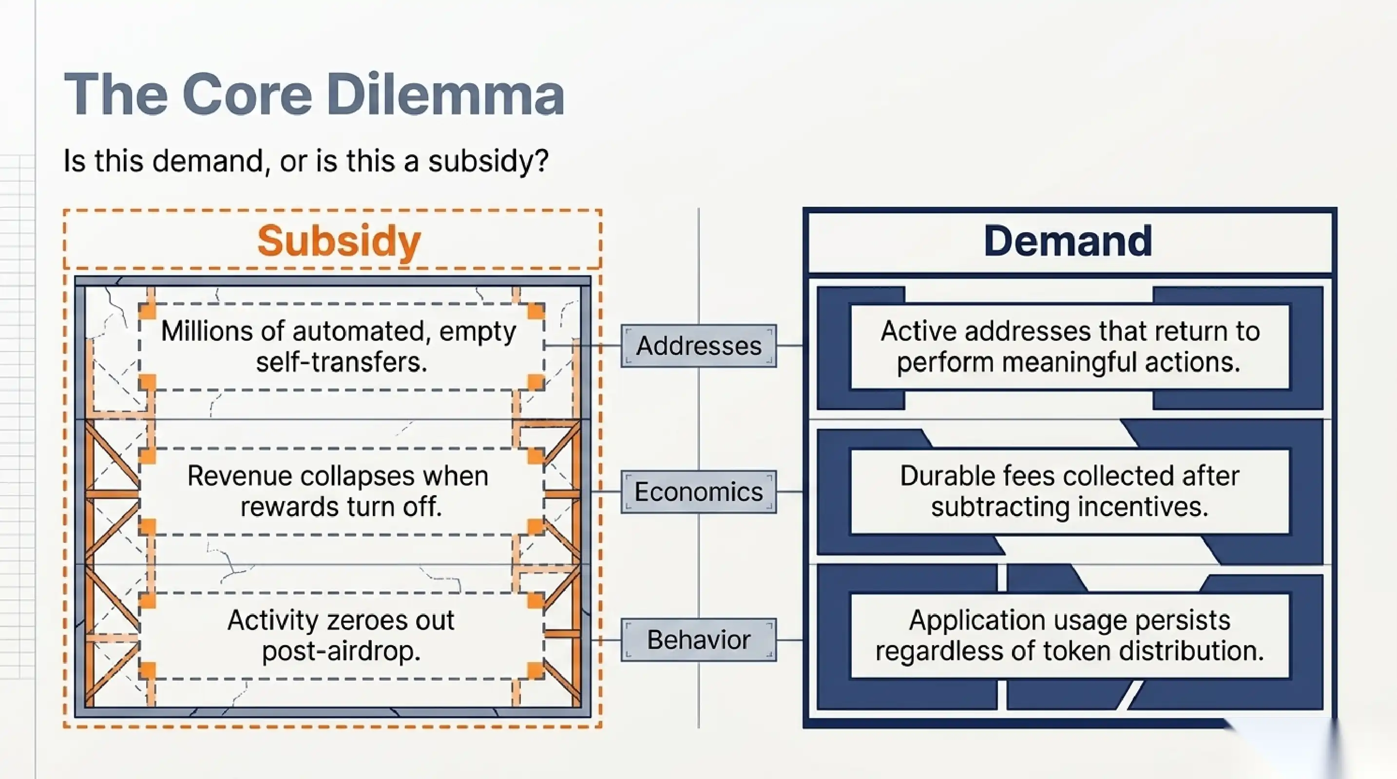
To read an L2 honestly, you have to ask the same question of every figure: is this demand or is this a subsidy. Demand stays after the incentives end. A subsidy leaves the moment the token distribution stops. The difference between the two decides whether it makes sense to build a business on the chain, hold its token or treat the pretty statistics as a temporary advertising campaign.
Why TVL lies first
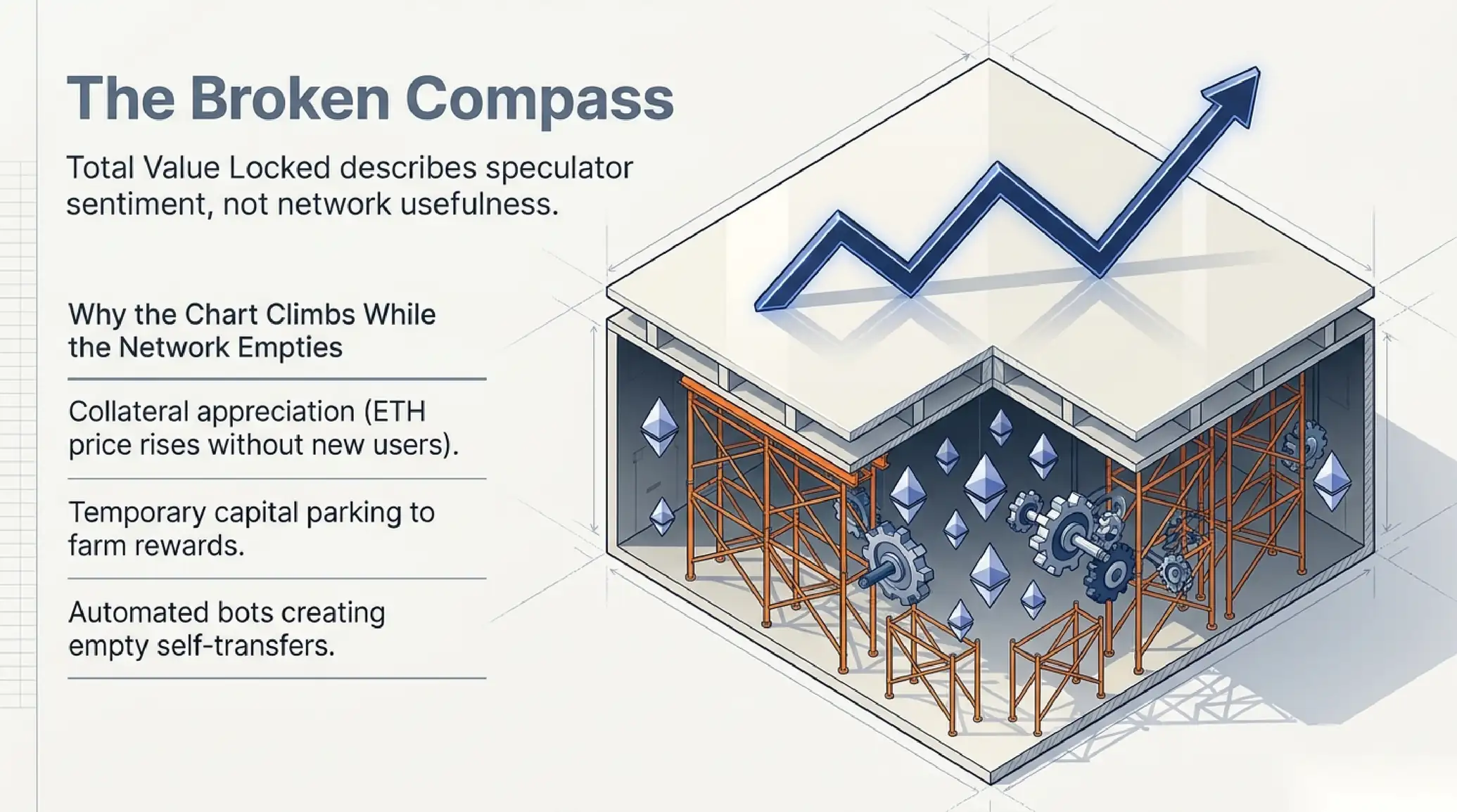
TVL counts the dollar value of assets sitting in contracts. That means it rises when ether or other collateral appreciates, even if not a single new user has arrived. It rises when a fund temporarily parks capital to farm rewards, and falls the same week the reward program ends. Such a number describes speculator sentiment rather than the usefulness of the network.
A more honest layer starts with active addresses, but there is a trap here too. One person can create a thousand addresses, and one bot can generate transactions purely to qualify for a future airdrop. So an isolated address count is nearly useless. Meaning appears when you look at retention: how many addresses active this month returned next month and performed a meaningful action rather than an empty self-transfer.
The most useful pair of metrics is the one that is hard to fake cheaply. The first is durable fees the network collects after subtracting incentives. The second is the share of transactions tied to real applications rather than self-addressed transfers. If fees hold and applications keep running after rewards are switched off, the demand is real. If everything collapses, you were watching paid traffic.
The sequencer is a point of centralization and profit
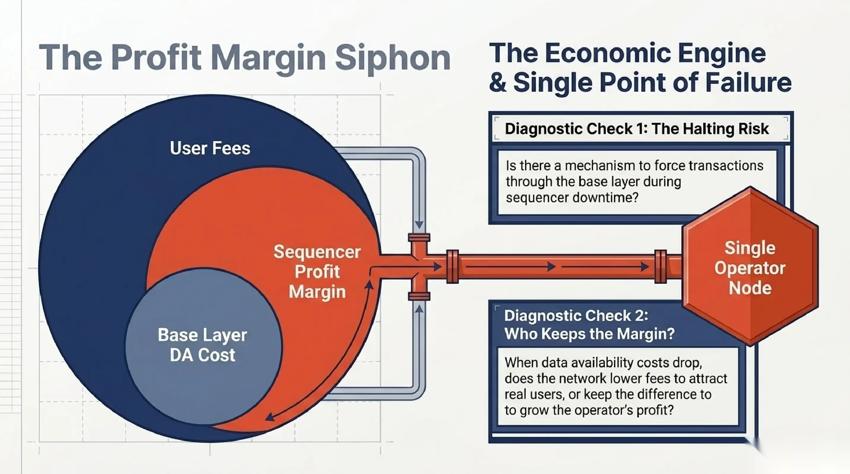
Most rollups today run on a single sequencer that accepts transactions, orders them and packages them for posting to the base layer. This is convenient and fast, but it is also the main point of centralization. One operator decides the order in which trades land, which means it controls both the ability to extract value from that ordering and the risk of the network halting when it fails.
For a metrics reader this implies two checks. First, what happens when the sequencer goes down. Is there a mechanism to force transactions through the base layer, or do users simply wait until the operator returns. Second, where the sequencer revenue goes. The gap between user fees and the cost of posting data to the base layer is the network’s pure margin, and it matters who ends up receiving it.
That margin is often the true economics of an L2. A user pays for a transaction, the network pays the base layer for data space, and the difference settles with the operator. When data availability grows cheaper after protocol upgrades, the margin widens, and the only question is whether fees drop for users or the profit stays in house. The sequencer revenue metric tells that story more honestly than any marketing.
Data availability and the cost of trust
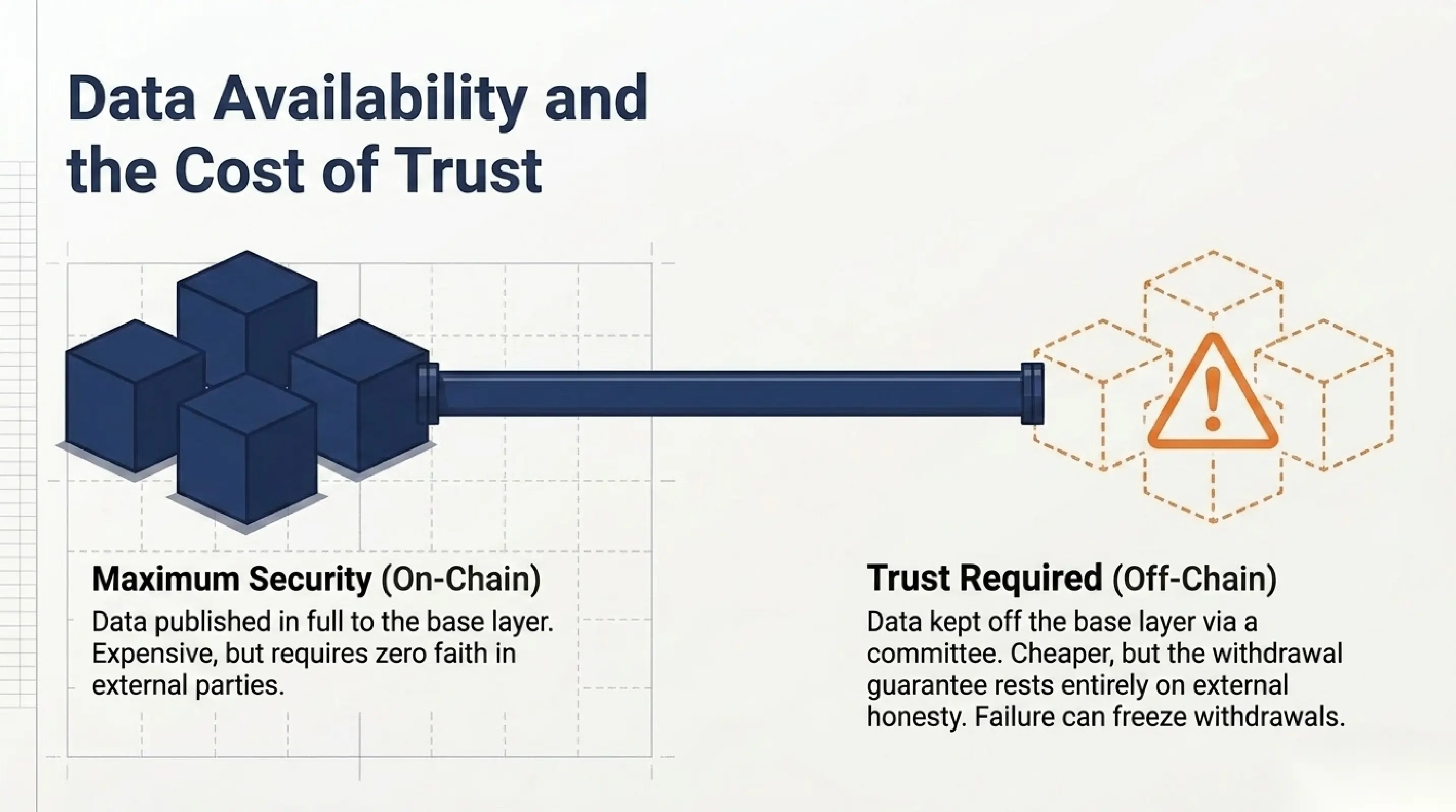
The security of a rollup depends heavily on where and how transaction data is published. If data goes to the base layer in full, anyone can independently reconstruct the state and challenge an incorrect transition. If data is kept off the base layer with a separate committee, the cost falls but a new trusted link appears, and its failure can freeze withdrawals.
This is not an abstraction but a direct trade-off between cost and security. Networks that publish everything to the base layer are more expensive to run but require no faith in an external committee. Networks with off-chain data availability are cheaper and faster, yet the user must understand that the withdrawal guarantee now rests on that committee’s honesty and uptime. No TVL chart will ever show this distinction.
When reading metrics it is therefore worth studying the network’s cost structure separately. After upgrades that cheapen data publication, a network faces a choice. It can compete for users with lower fees or keep the difference as profit. Both options are legitimate, but they signal different strategies, and an investor should know which strategy they are actually funding.
Bridges as the weakest point
Most capital enters an L2 through bridges, and bridges have historically lost more funds to exploits than anything else. So the metric of capital inflow through a bridge is at once a growth signal and a risk concentration signal. What matters is not only how much money arrived, but how the mechanism that holds that money on the other side is built.
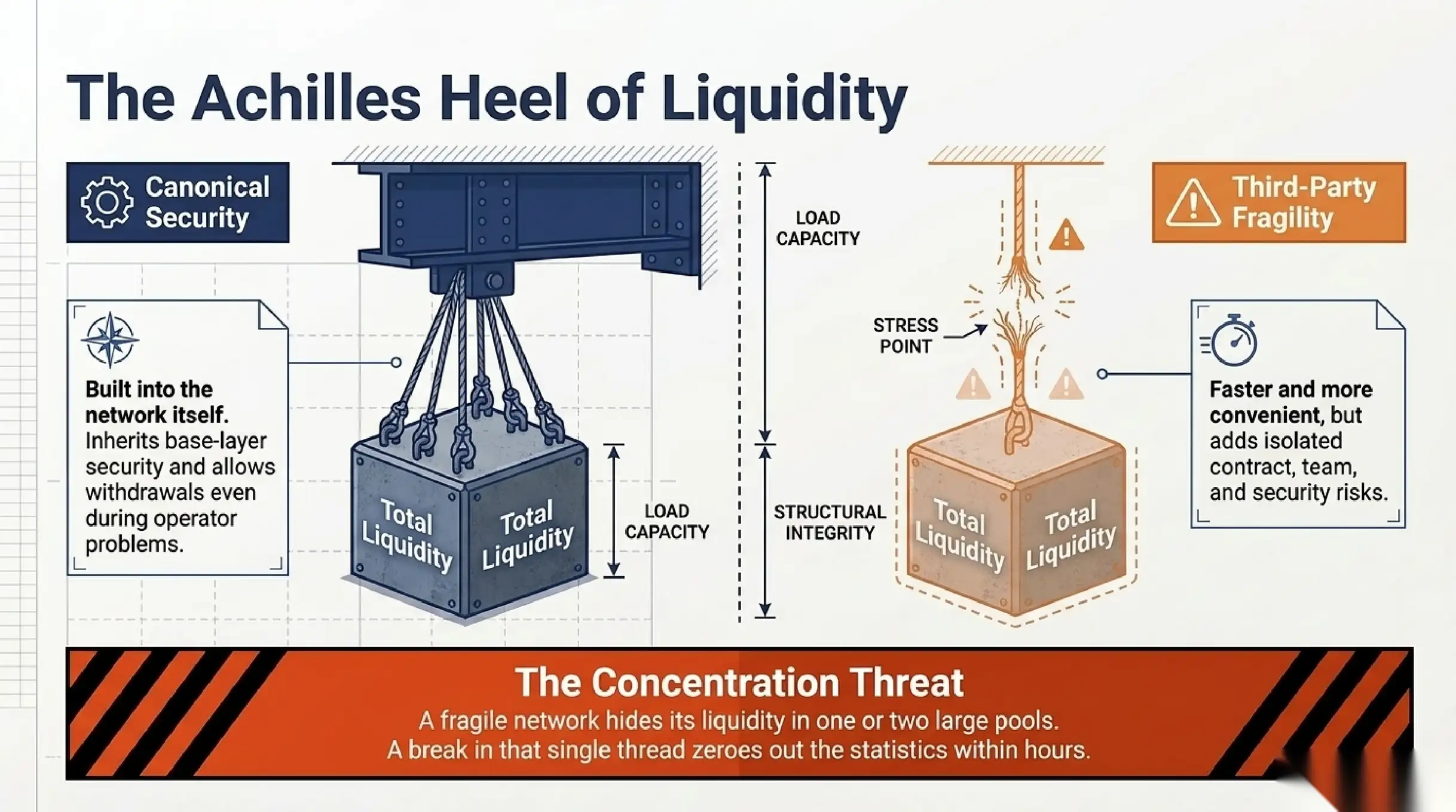
A canonical bridge built into the network itself usually inherits its security model and allows withdrawals through the base layer even when the operator has problems. Third party bridges with liquidity pools are faster and more convenient, but they add their own contract, their own team and their own risk. When a dashboard shows a large inflow, it helps to ask which bridge it came through and what happens to that money during an attack.
Concentration deserves separate attention. If the network’s main liquidity sits on one bridge or in a couple of large pools, the failure of one link hits the whole chain. A healthy network spreads entry and exit across several independent channels. A fragile network looks rich on a calm day, but its TVL hangs on a thin thread whose break can zero out the pretty statistics within hours.
What actually shows network health
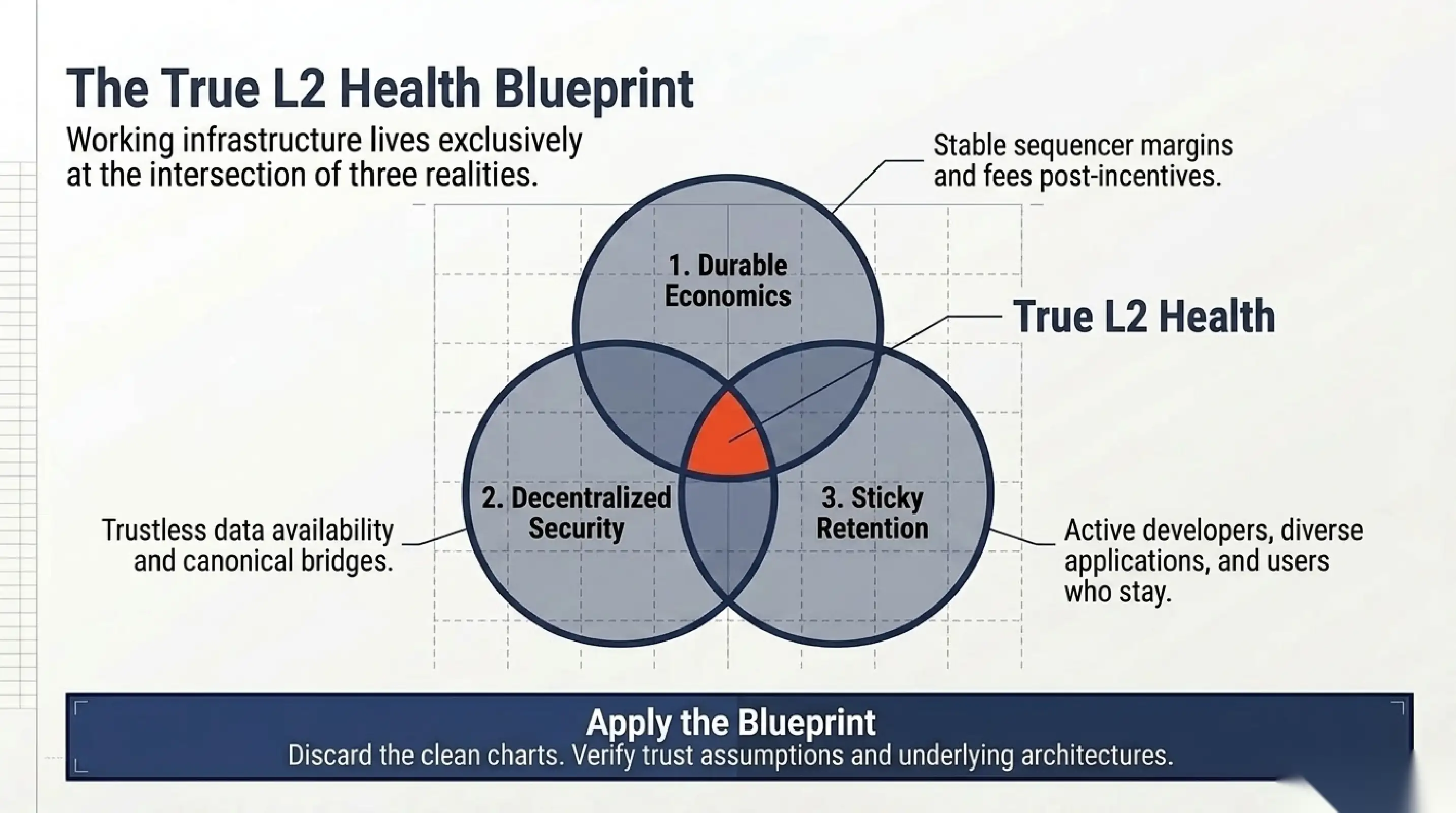
Building an honest picture requires a set of durable indicators rather than one loud figure. Durable fees after subtracting incentives show the economics. Retention of active addresses shows demand. The share of application transactions shows usefulness. Behavior during a sequencer outage shows decentralization. The structure of bridges shows where systemic risk is hidden.
It helps to check these metrics not on the best day but at the moment when the market falls and incentives are switched off. That is exactly when you can see who stays out of need and habit and who leaves with the giveaway. A network that loses nine tenths of its activity after a reward program ends was never what it painted itself to be. A network that loses a portion but keeps its core has earned attention.
The conclusion is simple: an L2 cannot be judged by one chart, because any single chart is easy to inflate or distort with asset prices. Real network health lives at the intersection of economics, decentralization and retention. A reader who holds those three axes in mind at the same time will tell working infrastructure from a temporary advertising campaign sooner than the market does.
The cost of blockspace and who pays for it
A transaction fee on an L2 is made of two parts: the charge for execution inside the network and a share of the cost of publishing data to the base layer. The user sees one number, but a complex economy sits behind it. When the base layer is congested, the cost of publishing data rises, and the network either passes it on to the user or cuts its own margin. A dashboard that shows only the average fee hides this mechanism and makes it hard to judge how sustainable the model is.
It is more useful to watch two things at once: how much the network charges the user and how much it pays the base layer over the same period. If the gap is stable and positive, the network has a healthy economy. If it collapses every time base layer activity spikes, the network’s growth was bought with a subsidy that cannot be maintained forever. In a bad phase such a network will be the first to raise fees or cut quality.
It is worth watching separately how a network behaves after protocol upgrades that make data cheaper. Some networks immediately lower fees for users and attract real demand. Others keep the difference and grow the operator’s profit. Both choices are legitimate, but they describe different strategies, and an investor should understand which one they are funding before drawing conclusions about the network’s long term value.
Application ecosystem versus empty blockspace
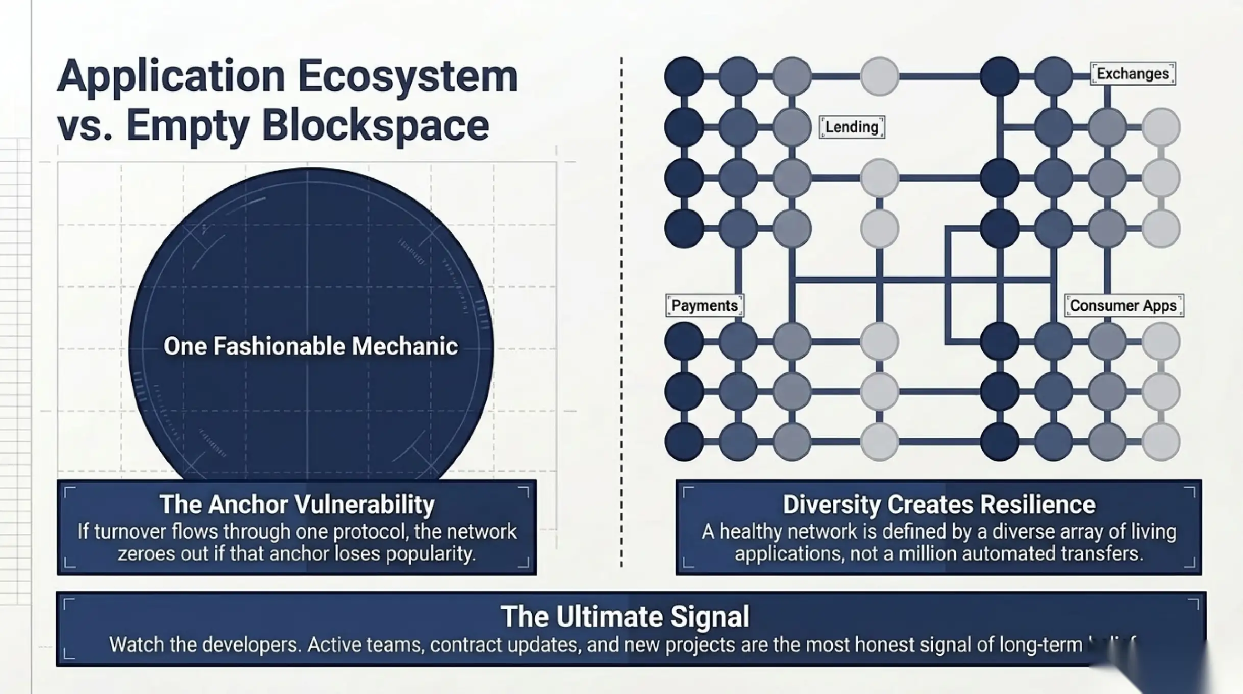
A healthy network differs from an empty one not by transaction count but by what stands behind those transactions. A few living applications that give users real utility matter more than a million automated transfers created for a future airdrop. So it helps to watch the concentration of activity: if almost all turnover flows through one protocol or one game, the network is vulnerable to the departure of that single anchor.
Diversity of applications creates resilience. When a network hosts lending protocols, exchanges, payment services and consumer applications, an outflow of users from one category is offset by the others. When everything rests on one fashionable mechanic, the end of its popularity zeroes out the network’s statistics within weeks. That is why a map of applications and their share of turnover says more about the future than the current activity peak.
Finally, it is worth watching the developers. The number of active teams, the frequency of contract updates and the inflow of new projects show whether the people who build on the network believe in it. Capital arrives and leaves quickly, while developers move slowly, so their behavior is a more honest signal of long term health than any total value locked chart.
Telling a temporary spike from structural growth
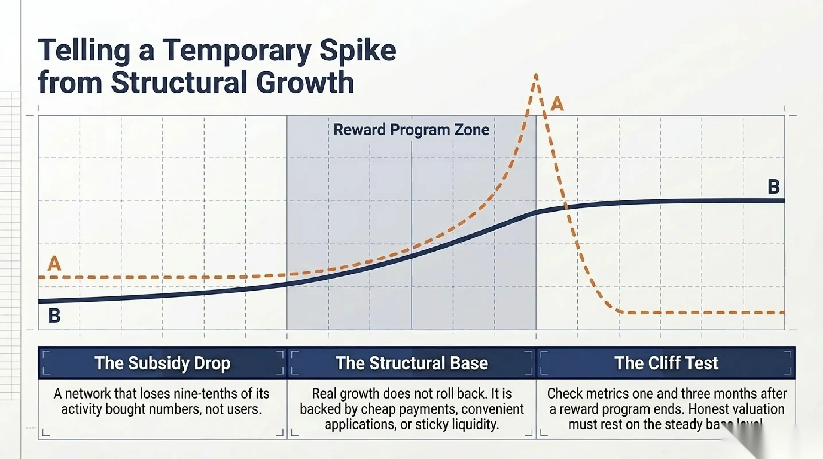
Many L2 metrics jump during incentives: reward programs, airdrops and marketing campaigns. The problem is that such growth disappears together with the payments. To tell a temporary spike from structural growth, it helps to watch the network a month and three months after an incentive ends. If activity falls almost back to the old level, the payments bought numbers, not users.
Structural growth looks different. It is slower but does not roll back, because a real need sits behind it: cheap payments, convenient applications or liquidity that cannot be quickly reproduced elsewhere. So when reading a dashboard, watch the steady level between campaigns rather than the absolute peak, because that base level shows how many people would stay if every incentive vanished tomorrow, and it is what an honest valuation should rest on.
Examples and sources
To check layer two metrics, the research on L2BEAT is useful, because for each Ethereum network it shows trust assumptions rather than only a clean chart. Large rollups such as Arbitrum and Optimism let you compare real network activity against the reported TVL.